
BRIEF
The Japan Tobacco International briefed us to conceptualize & create a key visual to be rolled out on different collateral in stores. This was a great brief as Camel has a lot of room for creativity. I went with a 3D approach, creating a stage for the Camel Packs. Below are the three different drafts that were sent to client along with a little write up of the thinking behinf each layout.
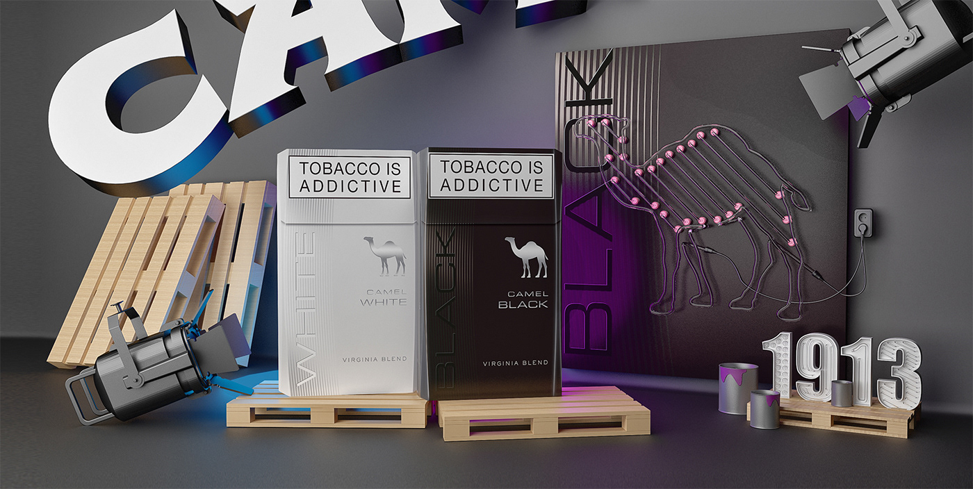
Route 1: The beast in lights
This route will explore the beast (camel icon) as the main visual element of the scene. The beast is made from neon tubes which will illuminate the scene as well as the packs. The scene also includes quite a few wooden pallets, paint cans and a neon 1913 design.
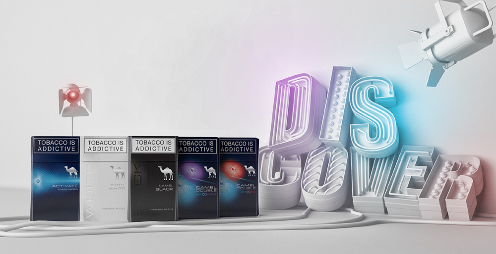
Route 2: Discover
This route is effective in its simplicity. Using phrases from Camel's word cloud in finished in neon.
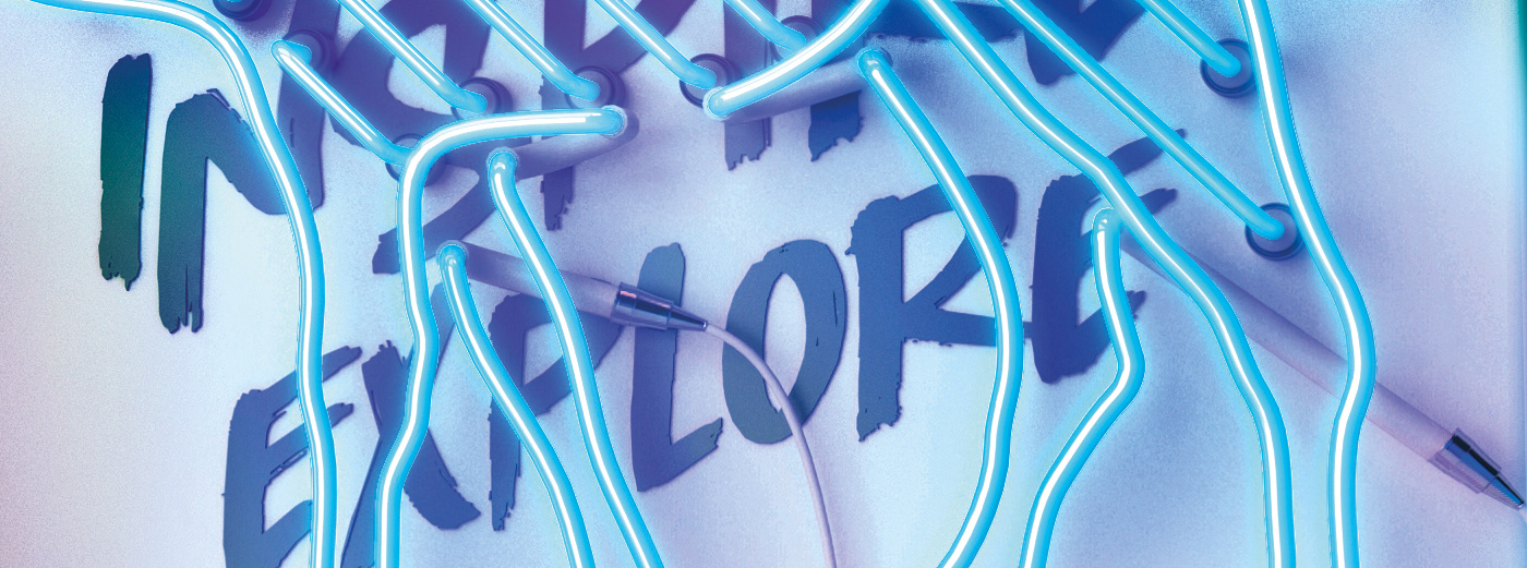
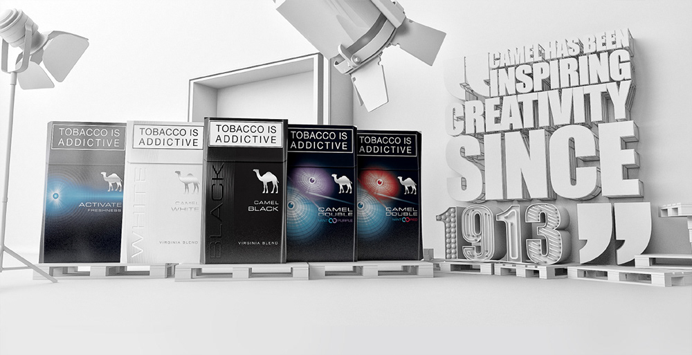
Route 3: Inspiring creativity
This route incorporates elements from Camels new bold typographic style. This route focuses more on typography and will have wooden accents fused with glossy elements, which fits Camel's iconic mix of textures and colour.
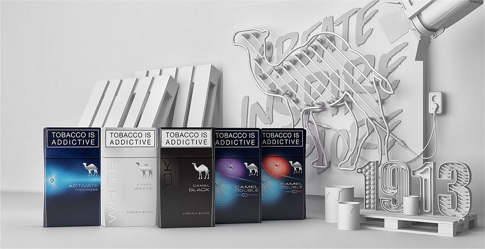
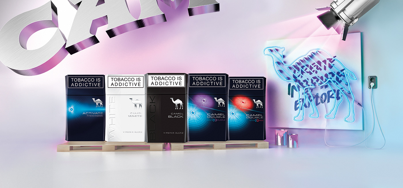
After choosing route 1, I proceeded to add color to the visual,working with colours from the pack & camel's C., the final version had to communicate the youthful & creative nature of the new double packs & keep a level of sophistication for the white & black packs.
These are some of the shots & test renders where I played with different layouts.


Final approved key visual & colour scheme!
Details


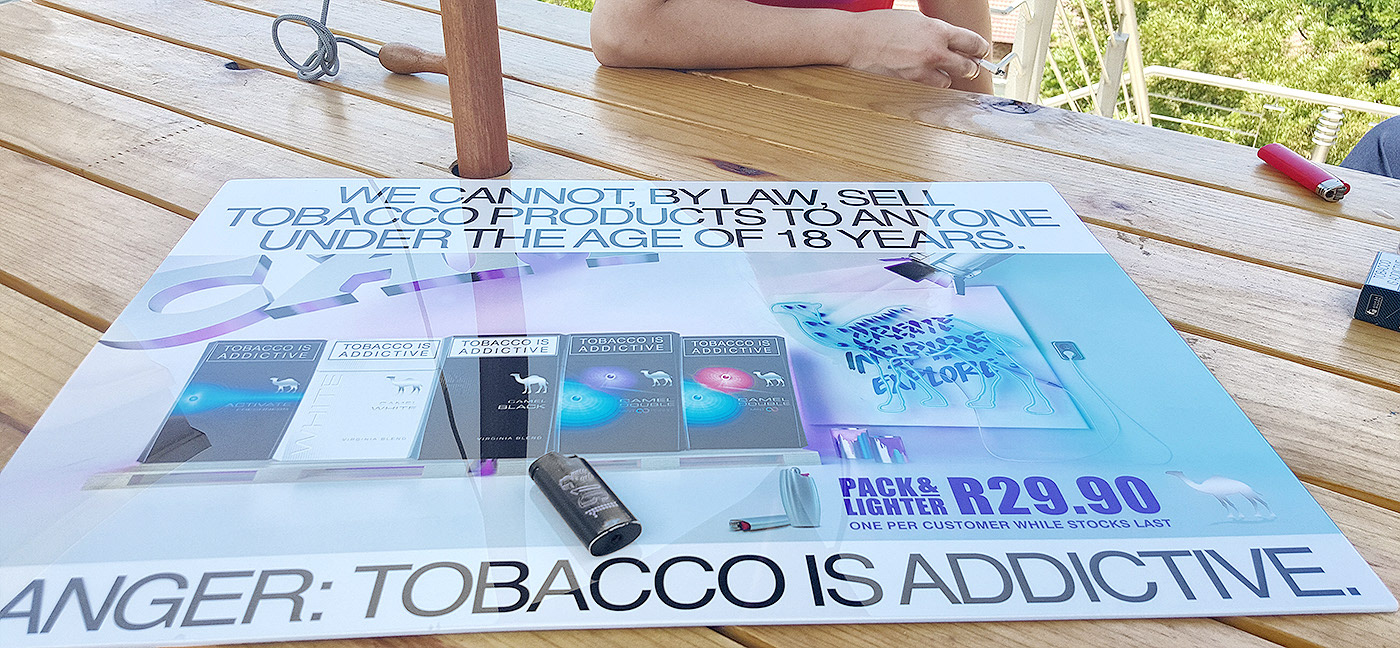
Roll out & limited edition lighter designs
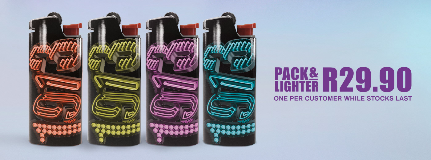

Price flash